YouTube Banner Photoshop Guide: Canvas, Guides and Export
A YouTube banner Photoshop file starts as exactly one thing: a 2560 × 1440 px RGB document at 72 ppi, exported under 6 MB. Everything that goes wrong after that — a channel name sliced off on phones, a soft and blotchy upload, a gradient that turns grey in the browser — comes from guides nobody set and an export preset nobody changed.
This is the full build, in the order you actually do it: document settings, both safe-zone guide coordinates to the half pixel, a five-layer structure that stays editable, type sizes that survive the shrink, and the export dialogue that keeps the file sharp.
The YouTube banner Photoshop document settings
Photoshop has no dedicated YouTube banner preset you can trust, so build the document by hand with File → New. These are the only settings that matter:
| Setting | Value | Why |
|---|---|---|
| Width × Height | 2560 × 1440 px | The upload size YouTube asks for; it is what TVs display in full |
| Resolution | 72 ppi | Screen artwork is measured in pixels — ppi changes nothing on upload |
| Colour mode | RGB, 8-bit | CMYK is for print and will shift every colour |
| Colour profile | sRGB IEC61966-2.1 | Adobe RGB files look washed out in browsers |
| Background | Dark solid (e.g. #0a0612) | Dark banners hide the edge where the crop ends |
| Artboards | Off | Artboards complicate the export for no benefit here |
Save the PSD before you draw anything. That layered file is your master — every future re-export, tweak and platform variant comes out of it.
The two safe zones, and the exact guide coordinates
Most tutorials mention one safe area. There are two, and the difference is where channel names get decapitated.
- 1546 × 423 px — the band desktop browsers and TVs keep. Artwork and atmosphere live here.
- 1235 × 338 px — the tightest all-device area. Your channel name, logo and handle must sit inside this box or a phone will cut them.
The fastest way to lay them down is View → Guides → New Guide Layout, twice, using margins instead of columns:
| Zone | Left / right margin | Top / bottom margin | Resulting guides |
|---|---|---|---|
| 1546 × 423 band | 507 px | 508.5 px | x 507 and 2053, y 508.5 and 931.5 |
| 1235 × 338 safe area | 662.5 px | 551 px | x 662.5 and 1897.5, y 551 and 889 |
Then lock them: View → Lock Guides. Nothing is more annoying than dragging a guide 4 px while trying to move a text layer, then wondering why the phone crop looks wrong.
To actually see what each device keeps, duplicate the file and run Image → Canvas Size with the anchor in the centre: enter 1546 × 423 for the desktop view, then 1235 × 338 for the worst-case phone view. If the name still reads at both, your layout is safe. If it does not, the fixes in our guide to a YouTube banner blurry or cut off on upload apply directly.
A five-layer build order that stays editable
Flat files are dead files. Build the banner in five groups, bottom to top, and you can re-skin it in ten minutes a year from now:
- Base — a Gradient Fill layer, not a painted gradient. Deep violet into magenta into sunset orange reads as the Vice City mood without touching anything of Rockstar’s.
- Atmosphere — skyline silhouettes, palm shapes, a neon grid. Keep this inside the 1546 band and let it bleed softly to the canvas edges.
- Focal art — one subject, placed off-centre so it never fights the channel name. Import it as a Smart Object so scaling never degrades it.
- Type — channel name, one-line tagline, handle. All three inside the 1235 × 338 guides.
- Grade — a Solid Color layer set to Soft Light at 10–20 %, plus a Curves layer. This is what makes five separate elements look like one image.
Use adjustment layers and layer masks for every effect. The moment you rasterise or merge, you have traded next year’s edit for ten seconds of convenience today.
Type sizes that survive the shrink
A banner is read at roughly 1235 px wide on a phone and about 290 px wide in a browser tab preview. Scale your type for the small end:
- Channel name: cap height of at least 90 px on the 2560 canvas — roughly a quarter of the safe area’s height.
- Tagline: 40–55 px, one line, six words maximum. Nobody reads two lines on a banner.
- Handle or upload schedule: 30–40 px, lower-left or lower-right of the safe area.
- Tracking: +20 to +60 on heavy display faces, or the letters merge at phone size.
Stick to one display face plus one neutral, and pick from typefaces proven to hold up small — our list of gaming channel fonts covers twelve that still read at 12 px. Keep text off busy artwork; if contrast is tight, add a 40 % black layer behind the type block rather than adding a drop shadow.
Export settings that keep it sharp
YouTube re-compresses whatever you give it, so you upload the cleanest possible source and let it do the damage once instead of twice.
- Edit → Convert to Profile → sRGB IEC61966-2.1 if your working space is anything else.
- File → Export → Export As (not Save for Web Legacy, whose default quality is far too low).
- Format JPG at quality 85–90 for photographic banners; PNG only if the design is flat colour with hard edges.
- Confirm the size reads 2560 × 1440 and scale is 100 % — no resampling.
- Check the file lands under 6 MB. A quality-88 JPG at this size normally comes in between 600 KB and 2 MB.
- Keep the PSD. Export a second copy at 1235 × 338 purely as a reference crop for yourself.
Two exports people get wrong: saving at quality 60 (which bands every gradient), and exporting a 10 MB PNG that YouTube simply refuses.
Photoshop, Canva or a designed banner?
Photoshop gives you the most control and the steepest first afternoon. Here is the honest comparison before you commit a weekend to it:
| Photoshop | Canva free | Custom design | |
|---|---|---|---|
| Cost | Paid monthly subscription | Free tier, paid elements | $45 one-off |
| Control | Total — layers, masks, blend modes | Template-bound | Total, briefed by you |
| Safe zones | Manual guides, both zones | Right canvas, no 1235 guide | Checked on every crop |
| Source file | Layered PSD you own | Stays inside Canva | Exports plus source file |
| First banner | 2–5 hours | 30–60 minutes | A brief and revisions |
| Best for | Creators who will redesign often | A placeholder tonight | A channel going public |
If you have no subscription, Photopea runs in a browser for free and opens and saves PSD files with the same guides and layer logic, so this entire walkthrough still applies. Prefer drag-and-drop? Follow how to make a YouTube banner in Canva instead. Still weighing it up, read the full YouTube banner template vs custom design comparison.
Skip the five hours — get the banner designed
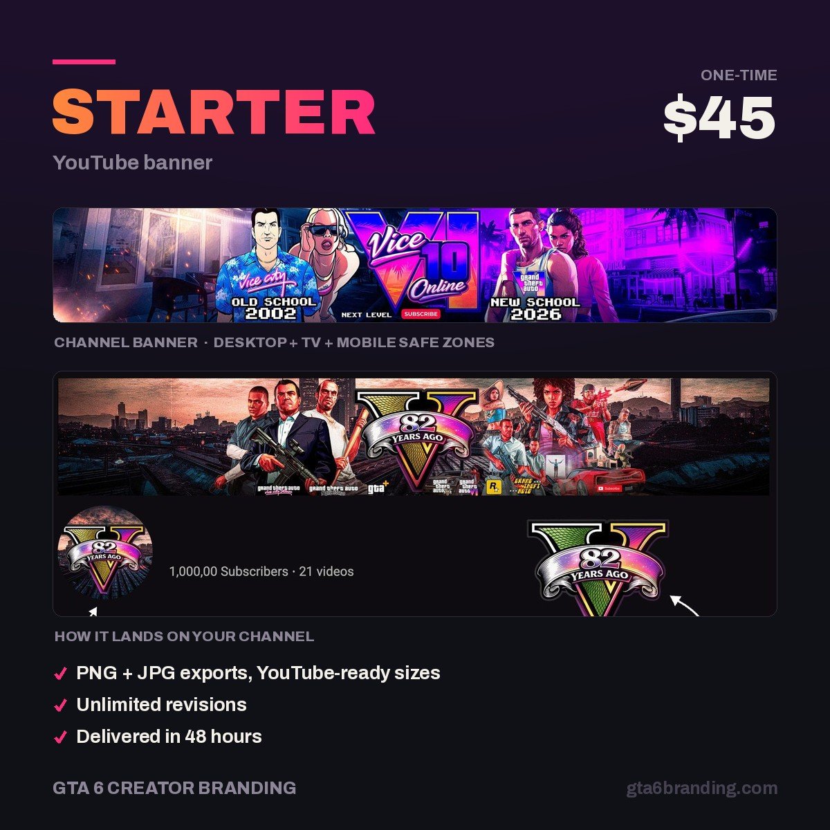
If you would rather spend the weekend filming than fighting guide coordinates, we build the banner for you: a 2560 × 1440 export checked on all four crops, your name locked inside the 1235 × 338 safe area, and the layered source file so it is yours to re-use.
- Starter — YouTube Banner, $45 — one custom banner, every device crop verified.
- Creator — Banner + Logo + Watermark, $79 — the matching set.
- Ultimate — Full Channel Identity, $199 — the whole channel.
Do and don’t
- Do set both guide layouts before you place a single pixel.
- Do keep art bleeding to the canvas edges so TVs never show a hard border.
- Do use Smart Objects for logos and imported art.
- Don’t put your channel name outside the 1235 × 338 box, however good it looks on your monitor.
- Don’t upscale a small image to fill 2560 px — it will look soft forever.
- Don’t use Rockstar’s logos, screenshots or key art. Build the mood yourself; our GTA 6 YouTube banner design guide shows how that reads without borrowing anything.
FAQ
What size should a YouTube banner be in Photoshop?
Build the document at 2560 × 1440 px, RGB, 8-bit, 72 ppi, and export under 6 MB. Inside that canvas, treat 1546 × 423 px as the band desktops and TVs keep, and 1235 × 338 px as the area where your channel name and logo must sit to survive phone crops.
Does Photoshop have a YouTube banner template?
There is no reliable built-in preset, so make your own once: a 2560 × 1440 document with both guide layouts locked and five empty layer groups. Save it as a PSD and reopen it for every future banner. That five-minute setup is the template, and it is more accurate than most downloads.
Why does my Photoshop banner look blurry on YouTube?
Three usual causes: you exported below 2560 × 1440 and YouTube upscaled it, you saved at a low JPG quality such as the Save for Web default, or you enlarged a small source image inside the file. Export at full size, JPG quality 85–90, sRGB, and keep the result under 6 MB.
Can I make a YouTube banner without Photoshop?
Yes. Photopea is free, browser-based and opens PSD files with the same guides, layers and blend modes, so every step here transfers. Canva is faster but template-bound and keeps your source file. A designed banner costs $45 and arrives already checked against all four device crops.
GTA 6 Creator Branding is an independent creator branding service and is not affiliated with Rockstar Games or Take-Two Interactive.