YouTube Banner Blurry or Cut Off? Every Fix That Works
A YouTube banner blurry on a desktop monitor but clean on your phone is the single most common complaint creators have about their own channel art — and it is almost never YouTube’s fault. Same story with the banner that gets cut off, where your channel name sits half outside the frame on mobile. Both problems trace back to one file: 2560 x 1440 pixels, which YouTube then crops differently for every screen it lands on and re-compresses on the way.
Below is what actually breaks, in the order it breaks, plus the export settings and the two safe zones that fix it for good.
The 10-second diagnosis
- Sharp on TV, soft on desktop → compression, not resolution.
- Soft on every screen → your source art was too small or upscaled.
- Channel name cut off on phones → text sits outside 1235 x 338.
- Logo clipped on desktop → art sits outside 1546 x 423.
- Upload rejected outright → the file is over 6 MB.
YouTube banner blurry? Start with these three causes
1. You uploaded something smaller than 2560 x 1440
YouTube asks for 2560 x 1440 px because that is the television crop — the full image, edge to edge, on a living-room screen. Every other device gets a smaller slice of the same file.
The trap is that most “YouTube banner size” guides print 1546 x 423 as the number to design at. That is the desktop band, not the canvas. Build your artwork at 1546 x 423 and you have handed YouTube a file roughly 60% of the width it needs, so it scales your work up to fill the TV crop. Upscaling never adds detail — it just makes soft pixels bigger. Our GTA 6 YouTube banner size guide lays out the full crop chain if you want the long version.
2. You squeezed it under 6 MB the wrong way
6 MB is the hard ceiling for a channel banner. That is generous for flat, graphic artwork and tight for photographic artwork, which is where people go wrong: they hit “export JPEG, quality 40” or drop the file into a generic online compressor and call it done.
Heavy JPEG compression attacks exactly the parts of a banner you care about — the hard edges of type and logos, and smooth neon gradients, which break into visible blocks and bands. The fix is to reduce file size by simplifying the artwork, not by crushing quality:
- Drop photographic texture and film grain from the background. Grain is the most expensive thing in the file and the first thing compression destroys.
- Replace a busy photo backdrop with a flat gradient plus a few hard shapes. A dark Vice City-style banner with bold type usually lands between 1 and 3 MB as a PNG.
- Export at quality 85–90 if you must use JPEG. Below about 75 the type edges start to halo.
- Never run a finished banner through a second compressor. You are compressing already-compressed pixels.
3. The artwork was upscaled before you ever uploaded it
This is the cause people never check, and the one that cannot be fixed after the fact. If any single element inside the banner was stretched past 100% of its real size, that blur is baked in before YouTube touches it. The usual suspects:
- A logo dragged in from a 300 px PNG grabbed off an old thumbnail, then scaled to 700 px.
- A generated image at 1024 x 1024 stretched to cover a 2560 px canvas.
- A gameplay screenshot captured at 1280 x 720 used as the full-width backdrop.
- A template from a free pack that was authored at 1546 x 423 and resized up.
Start the document at 2560 x 1440 and bring in every element at or below its native size. Logos should be vector (SVG or the layered source file) so they scale without loss — that is one of the reasons a proper GTA 6 YouTube banner design hands you source files, not just a flattened JPEG.
Why your banner gets cut off: the two safe zones, not one
Almost every guide online prints a single number — 1546 x 423 — and calls it the safe area. It isn’t. That rectangle is what desktop browsers and TVs show. Phones crop tighter still, to roughly 1235 x 338 centered on the same file. That is the real safe area, and it is the one your channel name, logo and @handle have to live inside.
One file, three nested zones. Text outside the green rectangle is text someone on a phone will never read.
Put the three zones to work like this:
| Zone | Who sees it | What belongs there |
|---|---|---|
| Full 2560 x 1440 | TV and living-room screens only | Atmosphere: skyline, sunset gradient, neon glow, palms. No words. |
| 1546 x 423 band | Desktop and laptop browsers | Supporting art, upload schedule strip, secondary shapes. |
| 1235 x 338 core | Every device, including phones | Channel name, logo, @handle, one short tagline. Nothing else. |
Designing it yourself? The step-by-step on how to make a YouTube banner in Canva includes the exact guide positions for both rectangles so you can see the crop while you work.
Export settings that survive the upload
Run this list before every banner upload. It takes under a minute and kills every cause above.
- Canvas exactly 2560 x 1440 px. Not 1546 x 423, not 2048 x 1152, not “close enough”.
- Export in sRGB. Anything else (Display P3, Adobe RGB) and your magenta and orange shift to a muddier version once the browser converts them.
- Nothing scaled above 100%. Check every layer, especially the logo.
- Channel name at least 70 px tall in the 2560 px file. Below that it becomes unreadable once the phone crop scales down.
- No 1 px strokes, no hairline script fonts. Compression eats thin lines first. Minimum 3 px strokes.
- Flatten and export once. No second pass through a compressor.
- Confirm the file is under 6 MB before you open YouTube Studio — then follow how to add a YouTube banner for the exact Customization › Profile upload path.
- Preview at 320 px wide. Shrink the exported file in any image viewer to a 320 px window — that is roughly how it reads on a phone. If the name is not instantly legible, the design is not done.
PNG or JPEG for a YouTube banner?
| PNG-24 | JPEG (quality 85–90) | |
|---|---|---|
| Best for | Flat colour, neon shapes, bold type, hard edges | Photographic backdrops, heavy grain, soft gradients |
| Typical size at 2560 x 1440 | 1–3 MB for graphic art | 0.6–1.5 MB |
| Type and logo edges | Stay perfectly sharp | Slight halo, invisible above quality 85 |
| Main risk | Blows past 6 MB if the art is photographic | Quality dialled too low turns gradients to blocks |
| Verdict | Default choice for a gaming channel banner | Only when the design is genuinely photo-led |
The 60-second banner audit
Open your channel on a phone, then on a desktop browser, and check both against these.
Do:
- Keep the channel name, logo and handle inside the centred 1235 x 338 core.
- Use one bold display face for the name and nothing thinner than a medium weight.
- Leave real breathing room between the name and the edge of the safe area — roughly 60 px on each side in the 2560 file.
- Match the banner’s colours to your logo, watermark and thumbnails so the channel reads as one identity.
Don’t:
- Fill the full 2560 x 1440 with important detail — most of it is invisible to most viewers.
- Put your upload schedule or social handles in the far corners. Those corners only exist on TVs.
- Stack more than three lines of text. Two is better.
- Use official Rockstar artwork, screenshots or the GTA wordmark. Build the Vice City mood from your own shapes and colours instead — see YouTube banner template vs custom design for where free packs tend to cut corners on this.
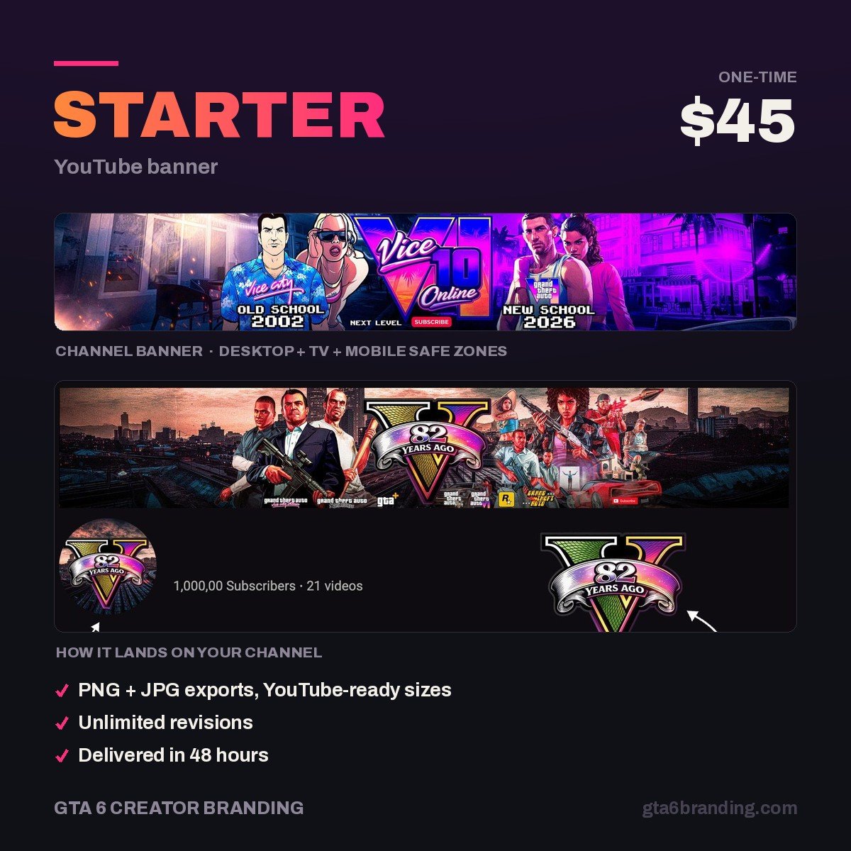
Want it right the first time?
We build GTA 6-era channel banners at the full 2560 x 1440 canvas, with the name and logo locked inside the 1235 x 338 safe area and every file delivered under YouTube’s 6 MB limit — so it is sharp on a TV and readable on a phone without you testing crops all afternoon.
- Starter — YouTube Banner ($45) — one custom banner, crop-tested across all three zones.
- Creator — Banner + Logo + Watermark ($79)
- Ultimate — Full Channel Identity ($199)
FAQ
Why is my YouTube banner blurry on desktop but sharp on TV?
Because the desktop view is a 1546 x 423 slice of your 2560 x 1440 file, scaled to fit the browser. If the original was compressed hard, those artifacts get magnified in the crop. Re-export at quality 85 or higher, or as a PNG, and re-upload.
What is the correct YouTube banner size?
Upload at 2560 x 1440 pixels, under 6 MB. Inside that file, 1546 x 423 is the band desktop browsers and TVs display, and 1235 x 338 is the tightest area that survives on every device. Keep all readable text inside the 1235 x 338 core.
Why is my channel name cut off on mobile?
Your text is sitting outside the 1235 x 338 centred safe area. Phones crop more aggressively than desktop, so anything placed using only the 1546 x 423 guide will lose its outer edges. Move the name, logo and handle inward and leave about 60 px of margin.
How do I get my banner under 6 MB without losing quality?
Simplify the artwork rather than lowering quality. Remove film grain and photographic texture, use flat gradients and hard shapes, and keep the layer count low. A graphic banner exports to 1–3 MB as a PNG with no visible loss. Avoid second-pass compressors entirely.
GTA 6 Creator Branding is an independent creator branding service and is not affiliated with Rockstar Games or Take-Two Interactive.