Gaming Channel Fonts: 12 Typefaces That Read at Thumbnail Size
The best gaming channel fonts are heavy, wide-countered display faces with short ascenders — Anton, Archivo Black, Bebas Neue and Chakra Petch survive almost anything you throw at them. Everything after that is a sizing decision and a pairing decision, and this guide hands you both: twelve typefaces worth using, the exact sizes for every YouTube asset, and the shrink test that eliminates most fonts before you commit.
Typography is the branding choice creators get wrong most often, because it is the one you judge at 100% zoom in your editor and your audience judges at 13% on a phone. With GTA 6 launching November 19, 2026 on PS5 and Xbox Series X|S — about 54 days out — every thumbnail you publish between now and then is a test of whether your type holds up.
The shrink test: why most fonts fail before they start
YouTube never shows your thumbnail at full size to a stranger. The first contact is almost always a small grid tile. Run the numbers: a 1280 × 720 px thumbnail rendered in a phone home feed occupies roughly 168 px of width — about 13% scale. Text you set at a generous 90 px comes out around 12 px on glass.
Twelve pixels is roughly the floor for legibility on a phone. That single constraint rules out script fonts, hairline geometrics, anything with delicate serifs, and any font you have to set below weight 700. It also explains why the same four or five typefaces show up on every channel that grows fast — they are the ones that still work at 13%.
The 12 best gaming channel fonts (and what each one is for)
Every font below is on Google Fonts, which means it is open source and free to use commercially — on thumbnails, on merch, in a logo, in a monetized video. That matters, because a takedown or a license dispute over a logo you already built a channel around is an expensive way to learn about font licensing.
| Font | Character | Best used for | Watch out for |
|---|---|---|---|
| Anton | Ultra-heavy, slightly condensed sans | Thumbnail headlines, 2–4 words | Single weight only — no light option to pair down to |
| Archivo Black | Heavy grotesque with real sidebearings | Wordmarks and logos | Wide — long channel names overflow the safe area |
| Bebas Neue | Tall condensed all-caps | Long words in tight space, lower thirds | Caps only; no lowercase to fall back on |
| Chakra Petch | Angular, clipped corners, techy | Heist, crime and near-future channels | Loses its edge below about 20 px |
| Teko | Squarish condensed, sporty | Esports, racing, stat overlays | Very narrow — needs generous tracking |
| Rajdhani | Semi-condensed with HUD geometry | On-screen stats, timers, overlays | Too light below 600 weight for thumbnails |
| Russo One | Wide, heavy, automotive | Car and racing content wordmarks | Only fits 1–2 words at banner scale |
| Orbitron | Geometric sci-fi, very wide | Short logo marks, 1–2 syllables | Unreadable in long strings — never body copy |
| Bungee | Display face built for signage | Neon and Vice City sign treatments | Heavy personality; nothing else can compete with it |
| Big Shoulders Display | Extremely condensed editorial | Long titles that must stay one line | Thin strokes at low weights vanish when scaled |
| Barlow Condensed | Neutral condensed workhorse | Subtitles, captions, secondary text | Too plain to carry a logo alone |
| Inter | Neutral UI sans, huge weight range | Descriptions, community posts, end-card small print | No personality — that is the point, use it as the partner |
If you want a shortcut: pick one from the top four as your display face, pair it with Inter or Barlow Condensed for everything small, and stop there. Two fonts is a brand. Five fonts is a folder.
Exact font sizes for every YouTube asset
Sizes below are in pixels, measured at each asset’s full export resolution. Cap height is the height of a capital letter, which is what actually matters — two fonts set at the same point size can differ by 20% in visible height.
| Asset | Export size | Headline text | Secondary text |
|---|---|---|---|
| Thumbnail | 1280 × 720 px | 90–140 px cap height, 3–4 words | Skip it — one message per thumbnail |
| Channel banner | 2560 × 1440 px (safe area 1546 × 423) | 130–180 px channel name | 55–80 px tagline, one line |
| Logo / profile picture | 800 × 800 px | 1–3 characters only, 380–520 px | None — a PFP with a tagline is wasted |
| Watermark | 150 × 150 px | No text at all — shape or monogram | None |
| Lower third | 1920 × 1080 px frame | 56–72 px name | 36–44 px role or handle |
| End card | 1920 × 1080 px frame | 72–96 px call to action | 44–56 px, keep clear of end-screen elements |
The banner is the trap. Its safe area is only 423 px tall out of 1440, so a name at 180 px plus a tagline at 70 px plus breathing room already fills it. Keep the whole text stack under roughly 260 px and read the GTA 6 YouTube banner size breakdown before you export — every device crops that file differently.
How to pair two fonts without it looking accidental
The 90/10 rule
One display face carries about 10% of your words — the channel name, the thumbnail headline, the end-card hook. One neutral face carries the other 90%. Contrast the two hard: if your display font is heavy and condensed, your body font should be regular-weight and normal-width. Fonts that are only slightly different look like a mistake; fonts that are obviously different look like a decision.
Three pairings that work: Anton + Inter · Archivo Black + Barlow Condensed · Chakra Petch + Inter
Then lock it down. Write the two font names, their weights and their sizes into a one-page note and use nothing else. That note plus your gaming channel brand colors is effectively your style guide, and it is what makes thumbnails recognizable in a feed before anyone reads a word.
The GTA font trap: skip the wordmark lookalike
Search “GTA font” and you will land on Pricedown, a fan-made typeface that imitates the look of the series wordmark and circulates free on font-download sites. Rockstar has never published the typefaces behind its own branding, so what you are downloading is a lookalike, not the real thing — and many of those download pages list it as personal-use only, which is not the license you want under a monetized channel.
The bigger problem is strategic. A logo set in a wordmark lookalike reads as official promotional material, and the one thing an independent creator cannot afford is for viewers — or a rights holder — to think the channel is speaking for the publisher. It also makes you look like the other 4,000 channels that had the same idea.
Borrow the era instead of the logo. The 1980s Miami feel that the setting draws on lives in wide geometric sans faces, italic speed slants, chrome and neon gradients, and tight all-caps tracking — none of which belongs to anyone. That is the approach behind these GTA 6 logo ideas, and it gives you a mark you can actually trademark and sell merch with.
Do and don’t
Do:
- Export one thumbnail, shrink it to 168 px wide, and look at it on your phone before you upload.
- Add a 6–10 px dark outline or a hard drop shadow behind thumbnail text so it holds against any background.
- Convert logo type to outlines or paths before you hand the file to anyone, so the font is not a dependency.
- Tighten tracking on all-caps display type by roughly −10 to −25 units; loosen it slightly on small caption text.
- Keep the same two fonts across thumbnails, banner, overlays and Shorts — including your GTA 6 thumbnail ideas variations.
Don’t:
- Use more than two typefaces anywhere on the channel.
- Stretch or squash type to make it fit — pick a condensed font instead.
- Set thumbnail copy over a busy screenshot with no plate, panel or gradient behind it.
- Rely on a font you found on a random download site without reading its license page.
- Put your channel name on the thumbnail. Your PFP already does that job.
Want the typography decided for you?
We build GTA 6–era channel identities with the type system already solved: one display face, one neutral face, tested at 12 px before it ships, and delivered with the fonts outlined so nothing breaks on your machine. You get a mark that reads in the comment circle and a banner that survives every crop.
- Starter — YouTube Banner ($45) — one banner, safe-area correct.
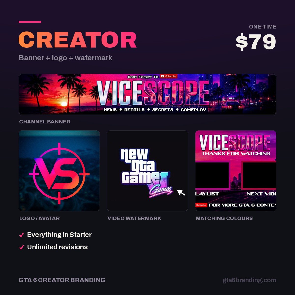
- Creator — Banner + Logo + Watermark ($79) — the same type system across all three assets.
- Ultimate — Full Channel Identity ($199) — plus intro, outro, overlays and a written style guide.
Once your gaming channel fonts are locked, the rest of the list is here: the full YouTube channel branding checklist covers all 12 assets with sizes and file limits, and the YouTube channel art cost guide shows what each piece goes for in 2026 if you would rather commission it.
FAQ
What font does GTA 6 use?
Rockstar has never published the typefaces behind its branding, so there is no confirmed answer. The font circulated online as the “GTA font” is Pricedown, a fan-made imitation of the series wordmark. Avoid it for a channel logo: it reads as official promotional material, and many download listings restrict it to personal use.
What font size should YouTube thumbnail text be?
Set headline text with a cap height of at least 90 px on a 1280 × 720 px thumbnail, and use 140 px if you only have two or three words. A phone home feed shows that file at roughly 168 px wide, which shrinks 90 px of type down to about 12 px — the practical floor for legibility.
Are Google Fonts free to use on a monetized YouTube channel?
Yes. Google Fonts are released under open source licenses that permit commercial use, including thumbnails, logos, overlays, merchandise and monetized videos, with no attribution required in your video. Fonts from other sources are a different matter — always open the license page and check whether commercial use is included before you build a logo on one.
How many fonts should a gaming channel use?
Two. One heavy display face for the channel name and thumbnail headlines, and one neutral sans for captions, overlays, descriptions and small print. A third font almost never adds information and it dilutes recognition, which is the entire point of having a type system in the first place.
GTA 6 Creator Branding is an independent creator branding service and is not affiliated with Rockstar Games or Take-Two Interactive.