GTA 6 Vice City Aesthetic: The Channel Branding Guide
The GTA 6 Vice City aesthetic is six things: a dusk gradient, neon used as a light source, wet reflective black, flat palm and skyline silhouettes, film grain, and heavy italic type. Copy those six cues and your channel reads as Leonida at a glance. Copy Rockstar’s actual artwork to get there and you are one claim away from losing your banner three weeks before launch.
GTA 6 arrives November 19, 2026 on PS5 and Xbox Series X|S, set in Vice City and the wider state of Leonida. This guide breaks the look into a palette you can paste as hex values, type rules that survive a 24-pixel shrink, the exact treatment for each channel asset, and the hard line between inspired and infringing.
What the GTA 6 Vice City aesthetic is actually made of
Strip the marketing away and the look is a small set of repeatable decisions. Every one of them can be rebuilt from scratch in Photoshop, Affinity or Figma:
- Dusk, never daylight. The sky runs violet into magenta into orange. There is no flat blue sky anywhere in this aesthetic.
- Neon as a light source, not a sticker. A sign does not just glow — it spills colored light onto the wet road, the car hood and the subject’s jaw. That spill is what separates a real Vice City piece from a pink filter.
- Wet reflective black. Asphalt, chrome, glass and water give you dark areas with bright specular streaks. Those dark areas are also where your text goes.
- Flat silhouettes. Palms, towers, power lines and a low skyline, drawn as solid black shapes with no interior detail. Cheap to make, instantly readable at thumbnail size.
- Grain and a touch of chromatic edge. A low-opacity noise layer plus a 1–2 px red/cyan offset on edges reads as 1980s video without tipping into parody.
- Heavy italic display type. Condensed, bold, slanted forward. Speed and attitude, with a thin chrome or gradient edge at most.
The Vice City color palette, in hex
Six values do the whole job: two darks to sit on, one hero color, two accents for the sunset, and one signal color that is not pink so your live badges and buttons stay visible. These are the exact values we build GTA 6 channel identities on.
The 60 / 30 / 10 rule. Give roughly 60% of every asset to the two darks, 30% to the violet-to-orange gradient, and only 10% to the hero magenta. Creators who flood the whole banner with pink end up with a surface where nothing stands out — including the channel name. Scarcity is what makes neon look like neon.
If you want to pressure-test the set before you commit, run it through the four checks in our guide to gaming channel brand colors — contrast at small sizes, how it behaves next to YouTube’s own red, whether it survives a grayscale export, and whether it still works on a white background.
Type: the one place creators copy too literally
The GTA wordmark is custom lettering owned by Rockstar. Tracing it, or hunting down a “GTA font” clone and setting your channel name in it, puts a trademark lookalike at the very center of your identity. You do not need it — the Vice City feeling comes from the weight and slant, not from those specific letterforms.
- Channel name: a heavy condensed sans with a 6–12° forward italic. One typeface, one weight, used everywhere.
- Everything else: a clean geometric or grotesque sans at regular weight for taglines, panel labels and schedule text.
- Two faces maximum. A third font is the fastest way to make a premium palette look like a free template.
- Run the 24-pixel test. Export your name at 24 px tall. If the letters merge, lose the outline, reduce the italic or drop a word.
Twelve display faces that hold up at thumbnail size, with exact point sizes per asset, are listed in our gaming channel fonts breakdown.
Where each cue belongs, asset by asset
The same aesthetic has to behave differently on a 2560-pixel banner and a 150-pixel watermark. This is the treatment per asset, with the specs YouTube actually enforces:
| Asset | Export size / limit | Vice City treatment |
|---|---|---|
| Channel banner | 2560 × 1440 px, max 6 MB | Gradient sky and skyline live in the outer thirds; keep the name, logo and handle inside 1235 × 338 px |
| Profile picture / logo | 800 × 800 px, max 4 MB | One flat shape, one accent, no gradient — it renders at 24 px in comments |
| Video watermark | 150 × 150 px transparent PNG, max 1 MB | Single-color version of the mark, no glow, no grain |
| Thumbnails | 1280 × 720 px, max 2 MB | Dark base, one neon accent, heavy italic text in the left or right third |
| Shorts cover | 1080 × 1920 px | Keep the subject and text in the middle third; the UI eats top and bottom |
| Membership badges | Render at 14 px in chat | Silhouette only — a palm, a sun, a car outline; no text |
Two numbers on that banner row matter more than anything else on this page. YouTube shows 1546 × 423 px on desktop and TV, but the tightest crop across all devices is 1235 × 338 px. Art can bleed to the full 2560 × 1440; anything a viewer must read belongs inside that 1235 × 338 core. Full crop-by-crop coordinates are in our GTA 6 YouTube banner design guide, and ten layouts that already respect it are collected in YouTube banner ideas.
The line between inspired and infringing
This is where channels get hurt. The aesthetic is not protected — a sunset gradient and a palm silhouette belong to nobody. Rockstar’s specific assets are a different matter, and so is anything that suggests you speak for them.
Safe to build
- Your own palette, gradients and grain — including every hex value above.
- Skylines, palms, cars and power lines you drew or vectorized yourself.
- Original lettering for your channel name, or a licensed commercial font.
- Licensed Miami-style photography from a stock library, recolored to the palette.
- Your own gameplay captures, used after release in thumbnails for your own videos.
Never put on your channel
- The GTA 6 wordmark, the roman numerals as styled by Rockstar, or the R★ logo.
- Official key art, cover art, press screenshots or character renders of Jason and Lucia.
- Trailer frames as a banner background — that is distribution of their footage, not commentary.
- Channel names or art implying you are official: “GTA 6 HQ”, “Rockstar News”, a verified-style checkmark baked into a logo.
- Another designer’s template or portfolio piece passed off as your identity.
What Rockstar’s fan policy does and does not permit, plus YouTube’s own impersonation rules, are covered in detail in our GTA 6 logo copyright guide. Read it before launch week, not after a strike.
Get the Vice City look built as a real identity
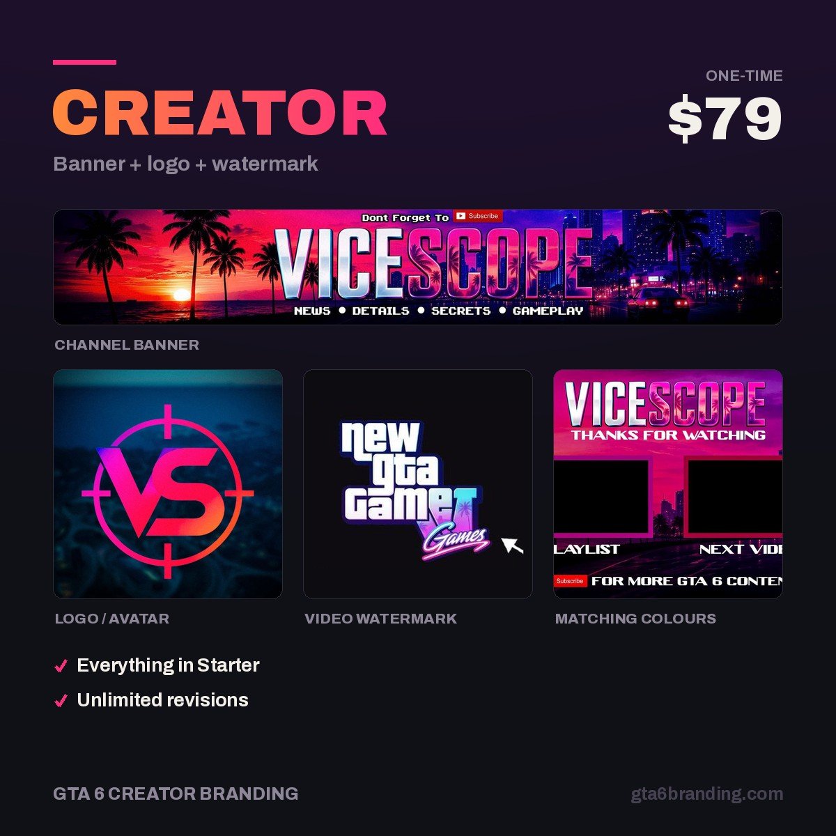
We design the whole look from scratch — original palette, original lettering, original silhouettes — so nothing on your channel traces back to Rockstar artwork. The Creator package delivers a matching banner, logo and watermark at every size above, with the channel name inside the 1235 × 338 safe core and transparent PNGs you own outright.
- Creator — Banner + Logo + Watermark ($79) — the full Vice City set, ready before November 19.
- Starter — YouTube Banner ($45) — just the banner, if your logo is already done.
- Ultimate — Full Channel Identity ($199) — banner, logo, watermark, thumbnails and badges on one system.
Build it once, export it everywhere
The aesthetic only pays off when it repeats. Lock these seven decisions in one master file and every future asset becomes a ten-minute export:
- Six hex values, written down — base, panel, violet, magenta, orange, signal.
- One display face for names, one sans for everything else.
- One gradient direction (we use left-violet to right-amber) reused on every asset.
- One silhouette library — your palms, towers and skyline as reusable vectors.
- One grain layer at a fixed opacity, applied last on every export.
- A master logo at 2048 px that scales down to 800, 150 and 72 px without edits.
- A 1235 × 338 guide box saved in your banner template so you can never drift outside it.
With launch on November 19, 2026, the practical deadline for all of this is early November — ahead of preload week, when your channel starts collecting its first wave of launch traffic.
FAQ
Is GTA 6 actually set in Vice City?
Yes. Rockstar has confirmed GTA 6 is set in Vice City and the surrounding state of Leonida, a fictional take on Florida. Vice City is the central urban area, but the map extends well beyond it, so “Leonida” is the safer word for branding that covers swamps, keys and highways too.
What colors make up the Vice City aesthetic?
A near-black base such as #0a0612, a deep panel violet like #160b26, night violet #7b2ff7, hero magenta #ff4d8d and sunset orange #ff7a3d, plus one non-pink signal color like #00d18f for live badges and buttons. Keep the darks at roughly 60% of every surface and the magenta at 10%.
Can I use GTA 6 screenshots or artwork in my YouTube banner?
No. Official key art, press screenshots, character renders and trailer frames stay Rockstar’s property, and using them as channel art is not commentary or review. Build your own gradient, silhouettes and lettering instead. Your own captured gameplay, after release, is fine inside thumbnails for your own videos.
What font should I use for a Vice City style channel logo?
Any heavy condensed sans with a slight forward italic will read as Vice City — the effect comes from weight and slant, not from Rockstar’s letterforms. Avoid “GTA font” clones of the wordmark. Whatever you pick, test it at 24 pixels tall, because that is the size your logo renders in comments.
GTA 6 Creator Branding is an independent creator branding service and is not affiliated with Rockstar Games or Take-Two Interactive.