Gaming Channel Brand Colors: The 3-Color System That Gets Clicks
Your gaming channel brand colors are the fastest way to look established before you have a single subscriber: three colors, used the same way on every thumbnail, banner and Short, and viewers start recognizing you in a crowded feed. Most new creators skip the system entirely — they pick two colors they personally like, apply them differently every upload, and end up with a channel that reads as visual noise at phone size.
Below is the system instead: three color roles, ready-made hex sets sorted by niche, the four tests a palette has to survive before you commit, and the exact assets those colors need to land on. It is written for creators building toward the GTA 6 launch on November 19, 2026 (PS5 and Xbox Series X|S), but the rules apply to any gaming channel.
The 3-color system behind gaming channel brand colors that work
Forget “pick a color scheme.” Assign each color a job, then keep it in that job forever. Three roles, split roughly 60 / 30 / 10:
The mistake almost everyone makes is treating the accent and the signal as interchangeable. If your pink and your amber both shout, nothing shouts. Pick which one wins, and demote the other.
Pick your palette from your niche, not your favorite color
Color carries meaning before anyone reads your title. A cold violet-and-green set reads as analysis; a hot orange-and-amber set reads as chaos and comedy. Match the palette to the promise your channel makes, then steal one of these sets outright:
| Channel niche | Feeling to hit | Base | Accent | Signal |
|---|---|---|---|---|
| News & leaks analysis | Urgent but credible | #0a0612 | #ff4d8d | #ffb347 |
| Map & exploration | Cinematic, wide-open | #160b26 | #7b2ff7 | #00d18f |
| Guides & money-making | Clear, useful, fast | #101018 | #00d18f | #ffb347 |
| Story & lore | Moody, premium | #0a0612 | #7b2ff7 | #ff7a3d |
| Comedy & chaos | Loud, high-energy | #160b26 | #ff7a3d | #ffb347 |
Every one of those sets is built for dark backgrounds, which is where gaming audiences actually live — the overwhelming majority of gaming viewers browse YouTube in dark mode, on a phone, at night. A palette designed on a white canvas usually falls apart there.
Four tests your gaming channel color scheme has to pass
Before you commit a palette to a logo, a banner and 50 future thumbnails, run it through these four. Each takes about two minutes.
The 4-test palette check
1. The dark-mode test. Drop your three colors onto #0f0f0f, YouTube’s dark background. If your base disappears into it, lighten the base to something like #160b26 so your banner still has an edge.
2. The 210px test. Export a 1280 × 720 thumbnail, then scale it to 210 px wide — roughly its size in a phone sidebar. If the accent and signal blur into one smear, the two colors are too close in value.
3. The 24px avatar test. Your 800 × 800 profile picture renders at about 24 px next to comments. At that size only one color survives. Make sure it is your accent.
4. The contrast test. Thumbnail text needs a contrast ratio of at least 4.5:1 against whatever sits behind it. Pure #ff4d8d text on #7b2ff7 fails. White or near-black text on either one passes.
Test 2 is the one that decides click-through rate. If you want the full breakdown of what survives a phone-sized preview, our guide to GTA 6 thumbnail ideas covers the layouts and text sizes that hold up.
Where each color actually has to appear
A palette is only worth something if it repeats. Here is the minimum set of places your three colors need to show up, with the sizes YouTube expects:
- Banner — 2560 × 1440 px: base fills the canvas, accent carries the channel name and any glow. Keep every colored element you care about inside the 1546 × 423 px safe area, or TV and desktop crops will eat it. The exact crop map is in our GTA 6 YouTube banner size guide.
- Logo / profile picture — 800 × 800 px: accent on base. Two colors maximum. If you need a third to make the mark work, the mark is too complicated — the GTA 6 logo ideas breakdown shows which shapes still read small.
- Thumbnails — 1280 × 720 px: base background, accent as a border or subject glow, signal on one to three words of text. Never more.
- Watermark — 150 × 150 px: single color, usually accent, at 60–80% opacity so it sits on footage without fighting it.
- End screens and Shorts covers: same base, same accent. This is where most channels drift and lose the recognition they just built.
Do this
- Write the three hex codes into a note and paste them into every project file. Guessing “about the same pink” each time is how drift starts. The note is really a YouTube brand style guide — one page that fixes the hex codes, fonts and logo rules for every future upload.
- Keep one near-white (#f4f1fa) and one near-black (#0a0612) for text. Those are utilities, not part of your three.
- Use the accent on the first frame of every video so the color registers even in autoplay.
- Pick colors with different brightness, not just different hue — that is what survives grayscale and small sizes.
Don’t do this
- Don’t copy Rockstar’s official palette, logos or press art. Build a look inspired by the Vice City mood — neon, sunset, coastline — and keep it your own. Our GTA 6 Vice City aesthetic guide has the whole look in hex, plus the line between inspired and infringing.
- Don’t use five colors because five looked good in the reference board. Five colors at 210 px is mud.
- Don’t put your signal color on the logo and the banner and the thumbnail text. It stops signalling anything.
- Don’t rebrand your palette every three months. Recognition compounds; resets throw it away.
If you are deciding between doing this yourself and paying for it, the tradeoffs and real 2026 price ranges are laid out in our breakdown of YouTube channel art cost. The short version: a palette is free to choose and expensive to apply consistently across every asset.
Want the palette built into every asset for you?
Choosing three colors takes an afternoon. Applying them consistently across a banner, logo, watermark, thumbnail template and end screens is where channels fall apart. We build the whole identity from one locked palette, so every upload reinforces the last one.
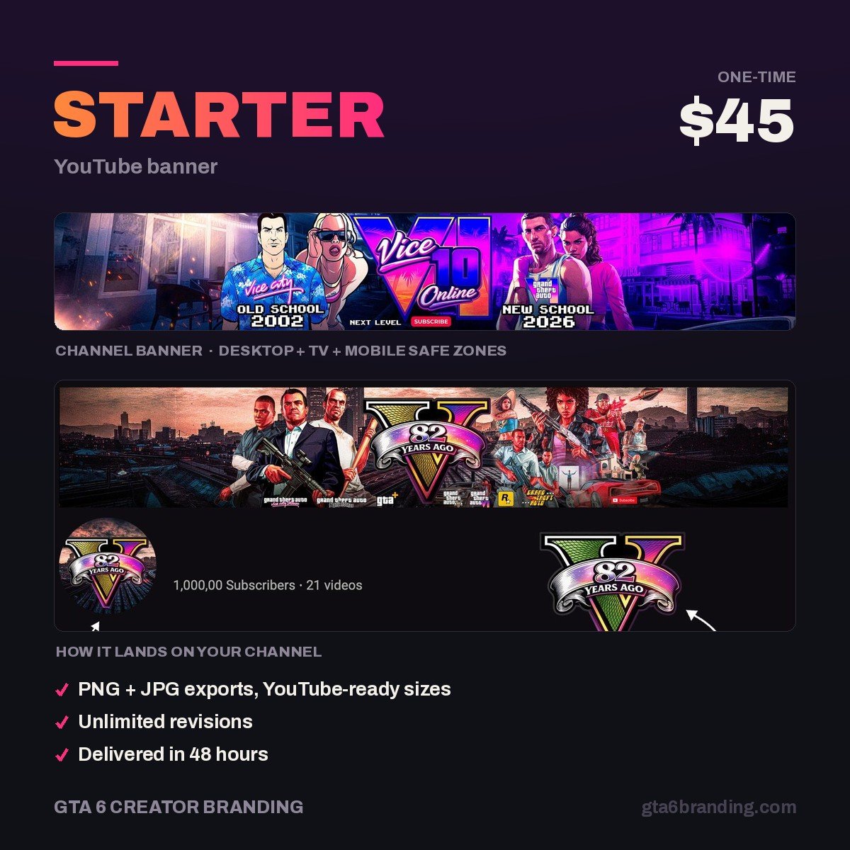
- Creator — Banner + Logo + Watermark ($79) — the three assets your palette has to live on first.
- Ultimate — Full Channel Identity ($199) — banner, logo, watermark, intro, outro and a thumbnail template, all locked to one color system and delivered with your hex codes.
FAQ
How many brand colors should a gaming channel use?
Three, plus a near-white and a near-black for text. One base color for backgrounds, one accent that carries your identity, and one signal color reserved for the single element you want seen first. More than three colors stops working the moment a thumbnail is scaled down to phone size.
What colors get the most clicks on YouTube thumbnails?
No single color wins on its own — contrast does. High-saturation warm colors like magenta, orange and amber stand out against YouTube’s dark interface, but a thumbnail only earns the click when its text and subject clearly separate from the background. Consistency across uploads beats chasing whatever color trends this month.
Should my logo and banner use exactly the same colors?
Yes — the same hex codes, not similar ones. Your logo appears at about 24 px next to comments while your banner runs 2560 px wide, so their proportions differ, but the colors must match exactly. Mismatched shades read as sloppy and quietly undercut the professional look you are paying for.
Can I use GTA 6’s official colors for my channel branding?
You can take inspiration from the Vice City mood — neon pinks, sunset oranges, deep purple night skies — but do not reuse Rockstar’s logos, fonts, key art or screenshots as your channel branding. Building an original palette in that atmosphere is both safer and far more memorable than borrowing someone else’s mark.
GTA 6 Creator Branding is an independent creator branding service and is not affiliated with Rockstar Games or Take-Two Interactive.